Lab 5: Responsive Framework in CSS
Part I: CSS Grid Framework
Build the CSS framework for a grid-based layout using a width of 1200px with possible partitions of 100px each.
Part II: Test the CSS framework by creating the webpage shown below.
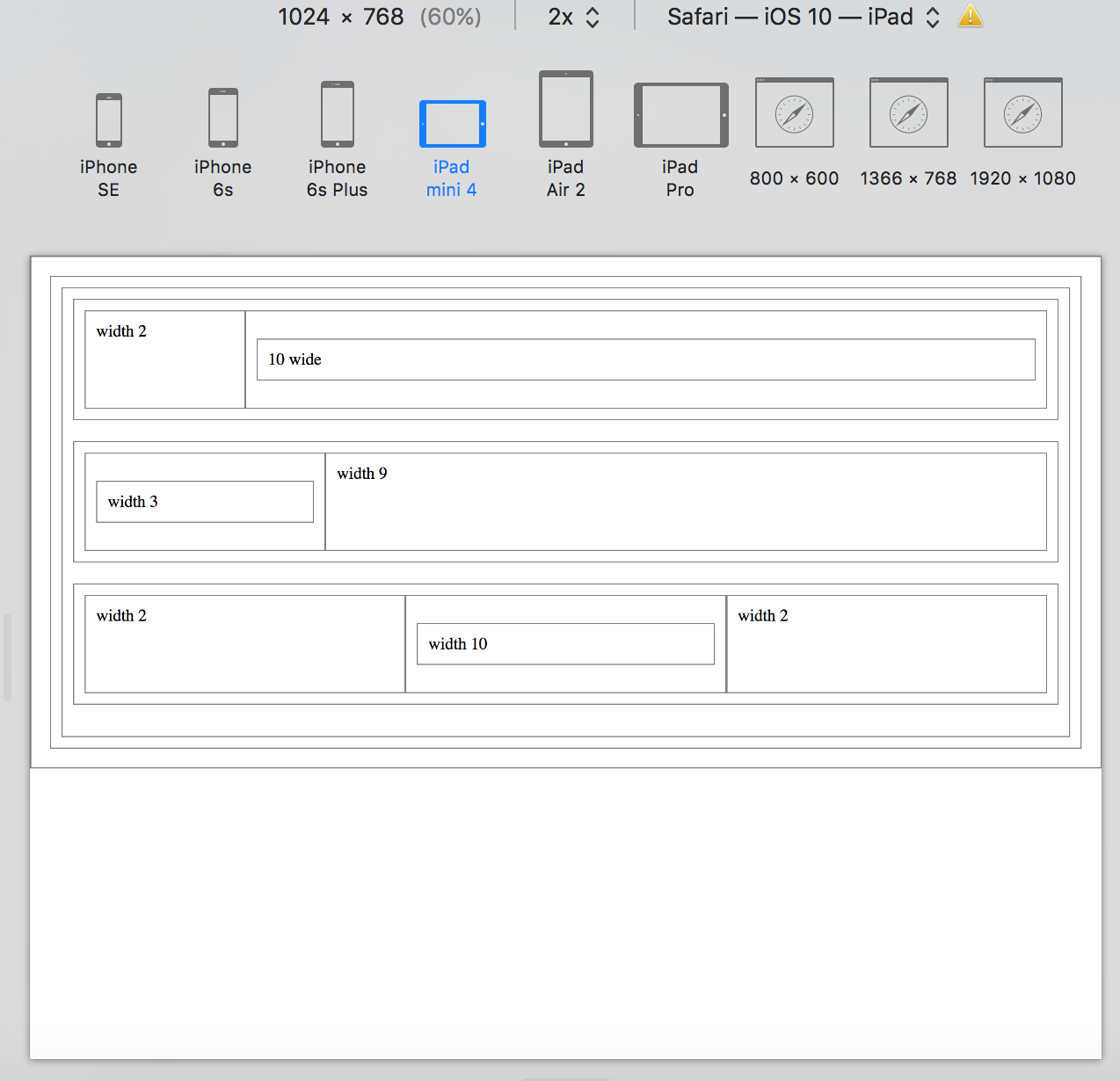
buildframework.html
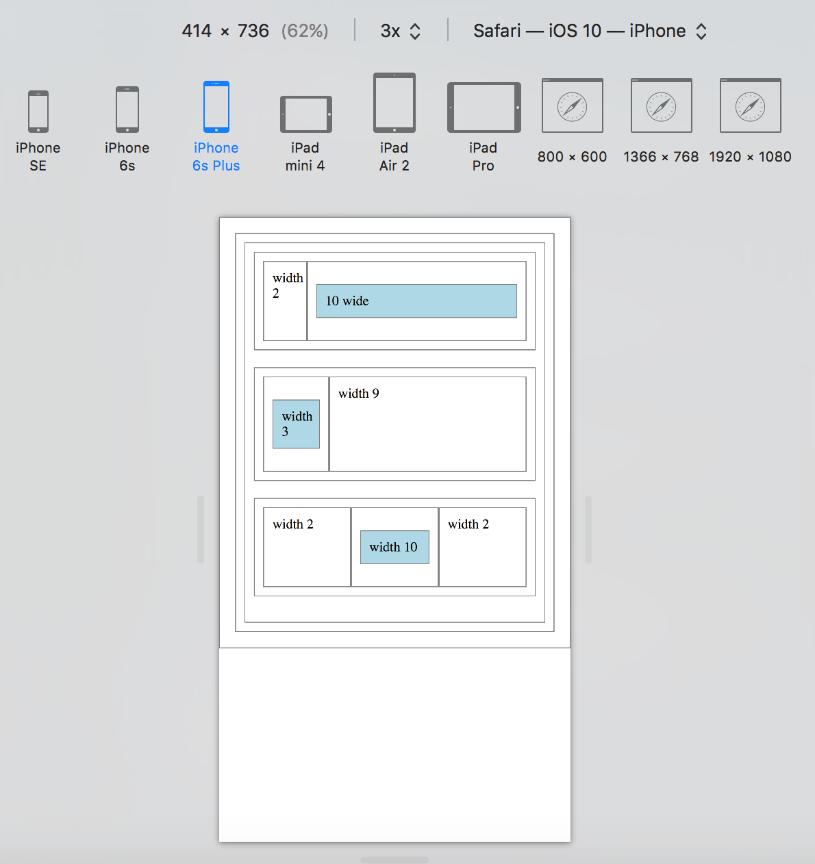
Part III: Add the responsive element shown in the image below.
Part IV: Explore Bootstrap and use its style selectors to
build the responsive website below.
The Bootstrap style selectors used in this page are:
- container
- row
- col-md-6
- col-md-12
- text-right
- text-uppercase
- img-responsive
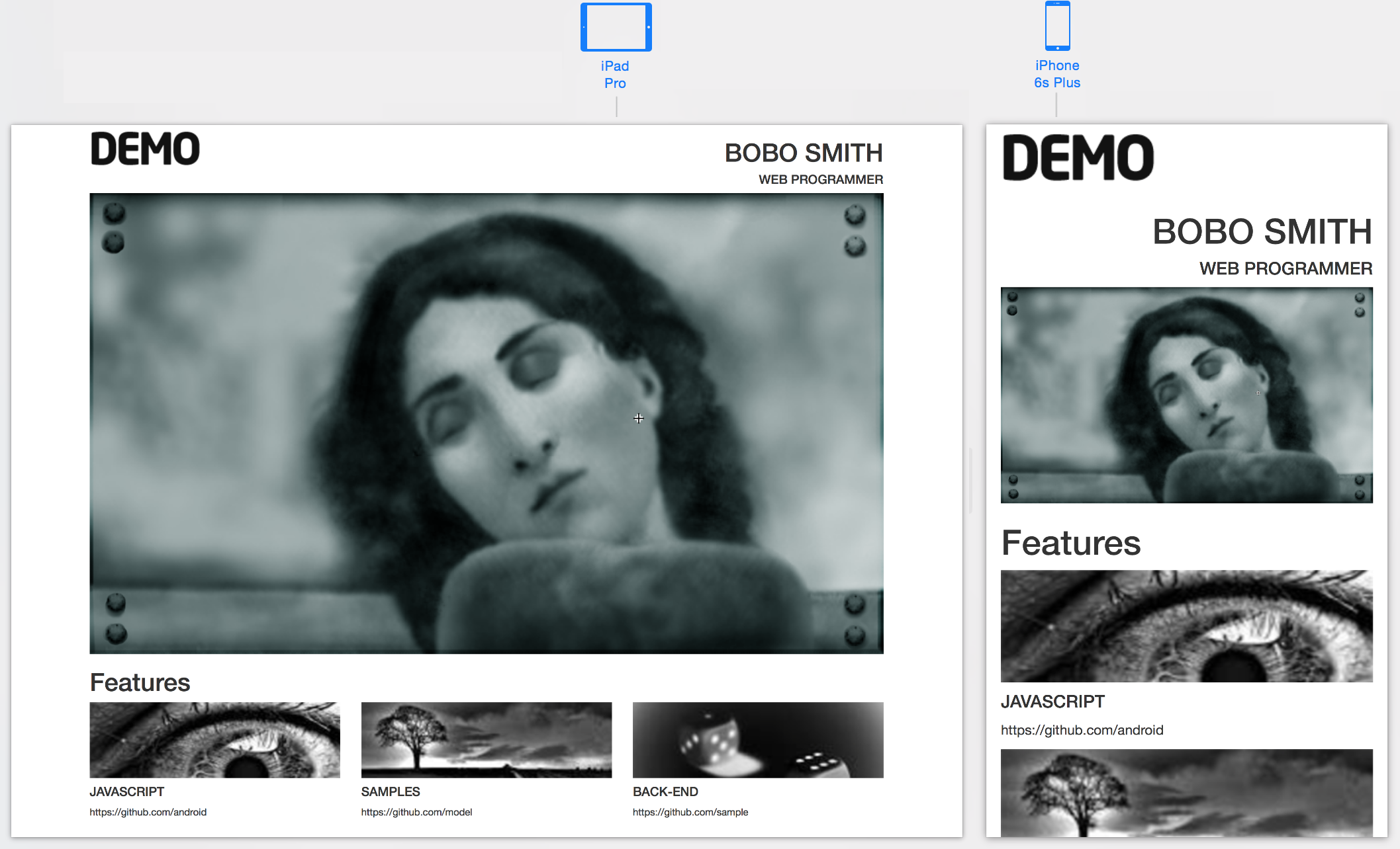
The images used for this webpage: